An Infographic or Information Graphic is a visual representation of complex data or knowledge. Infographics have been popular with journalists for years but increasingly product marketers are using them to communicate complex ideas or data in an engaging manner that also doesn’t take up a lot of space. Infographics are extremely popular online and great ones are often shared, even between people who don’t necessarily have an interest in the topic. Here are 5 things marketers and product marketers should think about when creating Infographics:
1/ Clearly define what you want to communicate – The goal of any great infographic is to tell a story. Numbers are just numbers, a great infographic can tell a story with the numbers in a way a simple graph can’t. Make sure you start with that goal in mind.
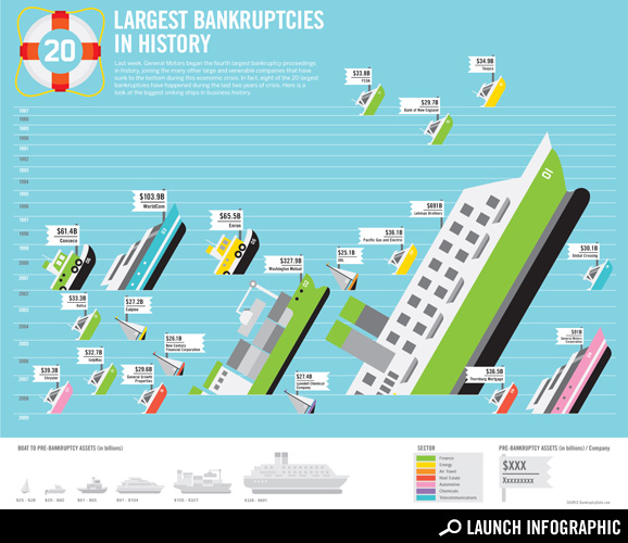
2/ Pick a type that matches your topic/data – There are a lot of different types of Infographics out there including timelines, maps, process diagrams, statistical, and more (the oldie but a goodie Periodic Table of Visualization Methods will give you an idea of just how many options you have). Here’s an example that blends a timeline with data and (cheeky) graphics:
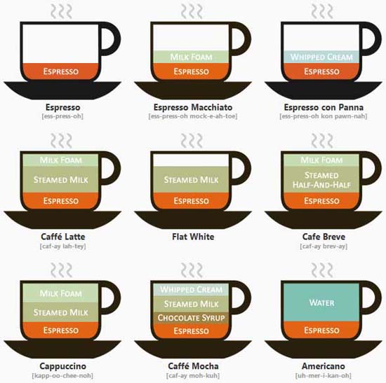
3/ Keep it simple (and reasonably small) – By definition you are trying to make the complex simple through the use of a graphic. Beware of trying to do too much with a single picture. For example, Lokesh Dhakar developed this infographic to help people understand what the differences were between espresso coffee drinks:

The result is clean and easy to understand. Contrast that with the often cited Web Trend Map, which although interesting to look at, in my opinion is way too complex to really be useful:
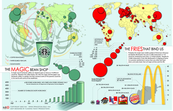
4/ Color and Typography matter a lot – Make sure that the colors and the typeface are appropriate for what you are trying to say and work with your branding. Here’s an example of an infographic with Starbucks and McDonald’s that makes use of their respective corporate colors:

5/ Have a call to action – If you’ve done your job right you’ve educated folks and gotten them engaged, now what? Make sure you include links to where they can learn more or if they are ready to take action, tell them how they can do so.
Further Reading:
There are a crop of blogs focused on the Infographic in all its forms including:
Also Edward Tufte has written the book on this stuff (several in fact).
The Infographics flickr pool is also full of inspiration.
Hey, you made it all the way to the end! You should subscribe! You can sign up for email updates, subscribe via RSS or follow me on Twitter.


Infographics: 5 Tips for Marketers : http://tinyurl.com/25zzblp (via @aprildunford)
RT I need a bigger box of crayons @aprildunford: blog post: Infographics-5 Tips for Marketers http://bit.ly/dgx9jR
RT @aprildunford: blog post: Infographics-5 Tips for Marketers http://bit.ly/dgx9jR
RT @aprildunford: Infographics: 5 Tips for Marketers http://bit.ly/dgx9jR
Wow, some of these are great and the flickr pool is really eye opening. Our problem is that we don’t have a graphics talent in-house to make something like these. How would you find someone who could help us make one of these?
Sandra
Hi Sandra,
Thanks for the comment. I agree that building a great graphic is going to take some specialized skill but not all of them have to be terrifically complex. I like the espresso example for that reason. Here’s a series of very simple ones that I really like to get you thinking about how you might take some baby steps with Infographics – from Tony Ng Design: the world of 100
April
Infographics: 5 Tips for Marketers : http://tinyurl.com/25zzblp (via @aprildunford)
blog post: Infographics-5 Tips for Marketers http://bit.ly/dgx9jR
RT @aprildunford: blog post: Infographics-5 Tips for Marketers http://bit.ly/dgx9jR
blog post: Infographics-5 Tips for Marketers http://bit.ly/dgx9jR #prodmgmt #marketing #infographic
Good reminder of what is needed and not when developing infographics RT@aprildunford Infographics-5 Tips for Marketers http://bit.ly/dgx9jR
Love the examples you shared, April! Companies seeking help developing infographics may want to consider XPLANE – http://www.xplane.com/
Hey Stephanie – thanks for the tip!
April
April,
Great post as always, and I love when Edward Tuffe gets a reference. His book should be standard reading for all product management types, and most marketing types as well.
As someone who was educated in the “hard sciences” (B. Sc. Physics here), it pains me to see information displayed poorly, or manipulated in ways that obfuscate the real intent. Marketing is thick with it, and it really cheapens the message.
Still, cleverly crafted infographics are useful, and can convey information in a relevant and engaging format.
Hi Geoffrey,
Thanks for the comment. I think that particularly in high tech a lot of us in product marketing struggle with how to convey complex technology, features, data and concepts in a way that people can understand. Great visuals is one way to do that that I think is under-used.
April
blog post-Marketing with Infographics http://bit.ly/dgx9jR
RT @aprildunford blog post-Marketing with Infographics http://bit.ly/dgx9jR
RT @aprildunford: Great reminder of how to find/use the right graphic. Love the Graphics Periodic Table. http://bit.ly/dgx9jR
RT @aprildunford: Infographics: 5 Tips for Product Marketers http://bit.ly/dgx9jR
RT @aprildunford: blog post: Infographics-5 Tips for Marketers http://bit.ly/dgx9jR
Great advice from @aprildunford: Infographics-5 Tips for Marketers http://bit.ly/dgx9jR RT @michelelinn
Infographics – 5 tips for B2B marketers by @aprildunford http://ht.ly/1WRwd
Need more than 150 words of written content? A picture is worth 1000 – Infographics: 5 Tips for Product Marketers http://tinyurl.com/25zzblp
RT @krismausser: A picture is worth 1000 – Infographics: 5 Tips 4 Product Marketers http://tinyurl.com/25zzblp
RT @krismausser: Need more than 150 words of written content? A picture is worth 1000 – Infographics: 5 Tips for Product Marketers http://tinyurl.com/25zzblp
It's infographic-mania! Love it! Recap of my 3 retweets this a.m: http://tinyurl.com/25zzblp, http://bit.ly/caOn8C, http://tinyurl.com/w2xzw
RT @jpfozo: RT @aprildunford: Infographics: 5 Tips for Product Marketers http://bit.ly/dgx9jR
For those who are interested how to make infographics http://www.rocketwatcher.com/blog/2010/06/infographics-tips-for-marketers.html
Hey, remember when software used to come with posters in the box? Everything old is new again.
LOL! I DO remember that! You must be old!
I actually designed one of those posters in my first marketing job. I was always amazed at how many times I saw it pinned up in cubicle when I went on customer visits!
April
A nice post on InfoGraphics – how to make your data look good http://bit.ly/ap4TJN #productMarketing
Eww RT @karlgude I hate this top #infographic. Metaphor gone awry. Boats? I mean really. A confusing, distracting mess. http://bit.ly/dsTKk4
Thanks for reinforcing the principles of marketing success, especially the need for a clearly defined message and a strong call to action.
Loved your succinctness and examples!
Hey, thanks!
April
simple and easy infographic steps to follow. Thanks. Always love seeing great work from fellow Dunfords too.